Note
Go to the end to download the full example code. or to run this example in your browser via Binder
Network basic manipulation
Load data
Load data where observations are put in same network but no segmentation
n = NetworkObservations.load_file(data.get_demo_path("network_med.nc")).network(651)
i = where(
    (n.lat > 33)
    * (n.lat < 34)
    * (n.lon > 22)
    * (n.lon < 23)
    * (n.time > 20630)
    * (n.time < 20650)
)[0][0]
# For event use
n2 = n.relative(i, order=2)
n = n.relative(i, order=4)
n.numbering_segment()
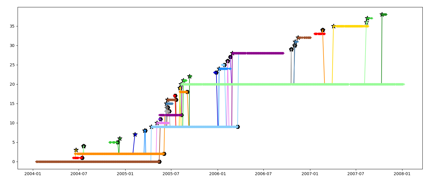
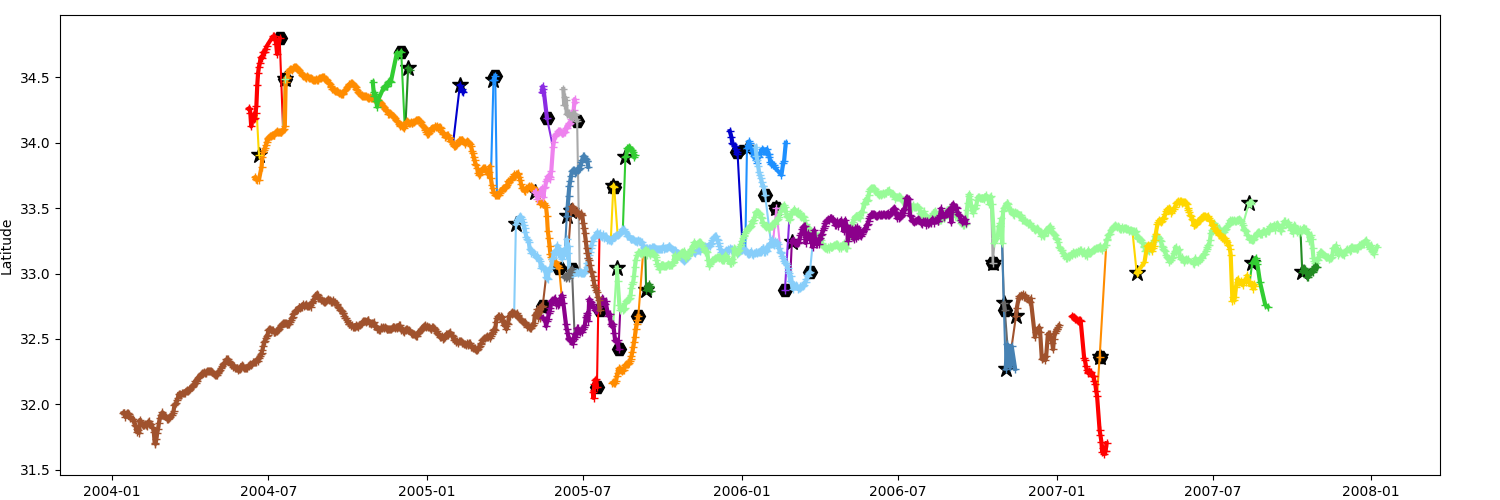
Timeline
Display timeline with events A segment generated by a splitting is marked with a star
A segment merging in another is marked with an exagon
fig = plt.figure(figsize=(15, 6))
ax = fig.add_axes([0.04, 0.04, 0.92, 0.92])
_ = n.display_timeline(ax)
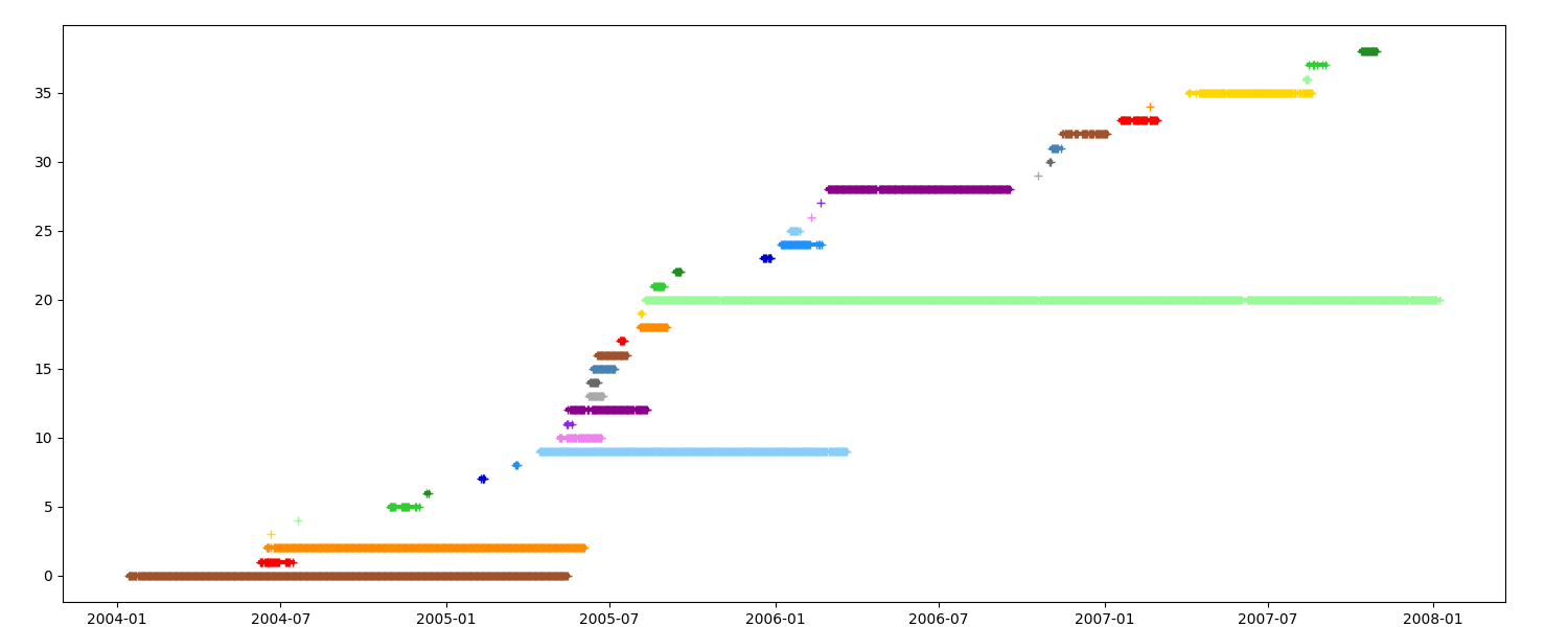
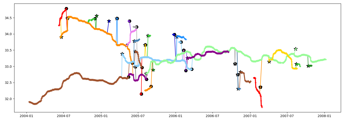
Display timeline without event
fig = plt.figure(figsize=(15, 6))
ax = fig.add_axes([0.04, 0.04, 0.92, 0.92])
_ = n.display_timeline(ax, event=False)
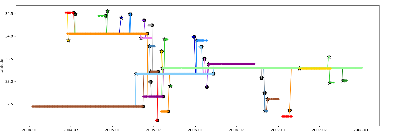
Timeline by mean latitude
Display timeline with the mean latitude of the segments in yaxis
fig = plt.figure(figsize=(15, 5))
ax = fig.add_axes([0.04, 0.04, 0.92, 0.92])
ax.set_ylabel("Latitude")
_ = n.display_timeline(ax, field="latitude")
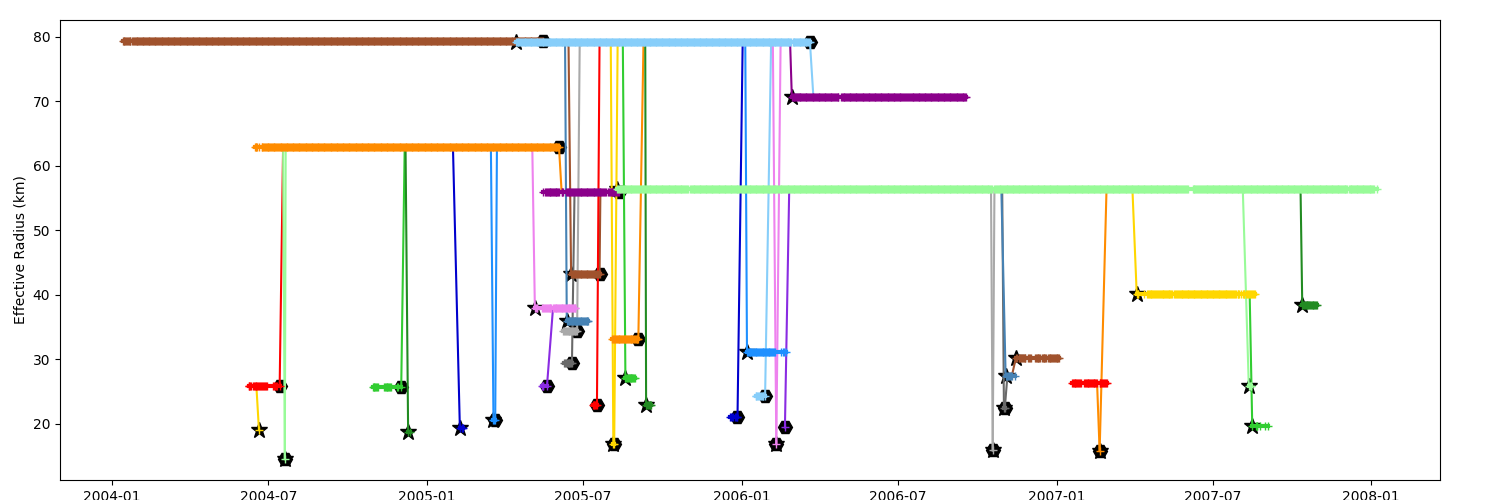
Timeline by mean Effective Radius
The factor argument is applied on the chosen field
fig = plt.figure(figsize=(15, 5))
ax = fig.add_axes([0.04, 0.04, 0.92, 0.92])
ax.set_ylabel("Effective Radius (km)")
_ = n.display_timeline(ax, field="radius_e", factor=1e-3)
Timeline by latitude
Use method=”all” to display the consecutive values of the field
fig = plt.figure(figsize=(15, 5))
ax = fig.add_axes([0.04, 0.05, 0.92, 0.92])
ax.set_ylabel("Latitude")
_ = n.display_timeline(ax, field="lat", method="all")
You can filter the data, here with a time window of 15 days
fig = plt.figure(figsize=(15, 5))
ax = fig.add_axes([0.04, 0.05, 0.92, 0.92])
n_copy = n.copy()
n_copy.median_filter(15, "time", "latitude")
_ = n_copy.display_timeline(ax, field="lat", method="all")
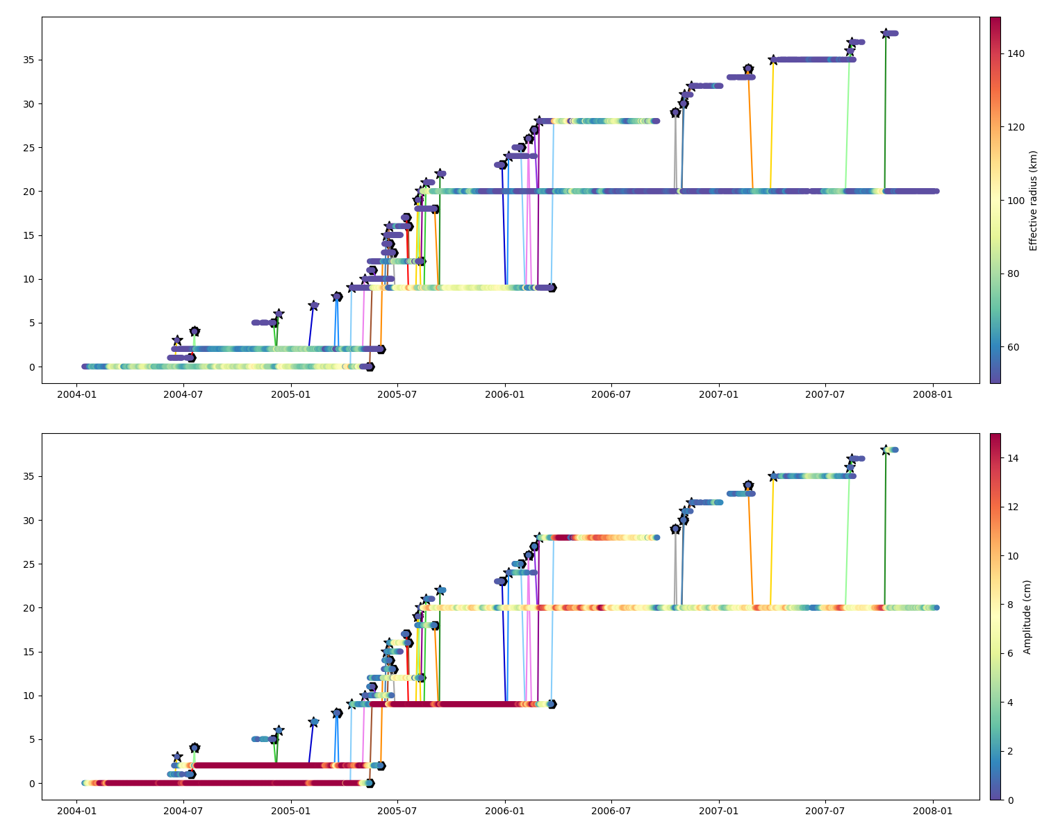
Parameters timeline
Scatter is usefull to display the parameters’ temporal evolution
Effective Radius and Amplitude
kw = dict(s=25, cmap="Spectral_r", zorder=10)
fig = plt.figure(figsize=(15, 12))
ax = fig.add_axes([0.04, 0.54, 0.90, 0.44])
m = n.scatter_timeline(ax, "radius_e", factor=1e-3, vmin=50, vmax=150, **kw)
cb = plt.colorbar(
    m["scatter"], cax=fig.add_axes([0.95, 0.54, 0.01, 0.44]), orientation="vertical"
)
cb.set_label("Effective radius (km)")

ax = fig.add_axes([0.04, 0.04, 0.90, 0.44])
m = n.scatter_timeline(ax, "amplitude", factor=100, vmin=0, vmax=15, **kw)
cb = plt.colorbar(
    m["scatter"], cax=fig.add_axes([0.95, 0.04, 0.01, 0.44]), orientation="vertical"
)
cb.set_label("Amplitude (cm)")
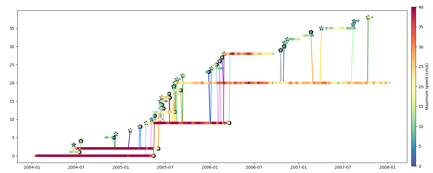
Speed
fig = plt.figure(figsize=(15, 6))
ax = fig.add_axes([0.04, 0.06, 0.90, 0.88])
m = n.scatter_timeline(ax, "speed_average", factor=100, vmin=0, vmax=40, **kw)
cb = plt.colorbar(
    m["scatter"], cax=fig.add_axes([0.95, 0.04, 0.01, 0.92]), orientation="vertical"
)
cb.set_label("Maximum speed (cm/s)")
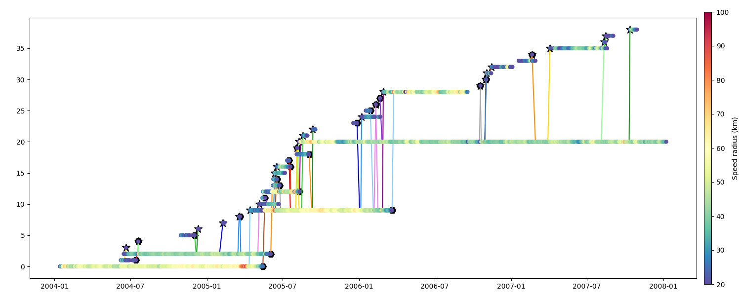
Speed Radius
fig = plt.figure(figsize=(15, 6))
ax = fig.add_axes([0.04, 0.06, 0.90, 0.88])
m = n.scatter_timeline(ax, "radius_s", factor=1e-3, vmin=20, vmax=100, **kw)
cb = plt.colorbar(
    m["scatter"], cax=fig.add_axes([0.95, 0.04, 0.01, 0.92]), orientation="vertical"
)
cb.set_label("Speed radius (km)")
Remove dead branch
Remove all tiny segments with less than N obs which didn’t join two segments
n_clean = n.copy()
n_clean.remove_dead_end(nobs=5, ndays=10)
n_clean = n_clean.remove_trash()
fig = plt.figure(figsize=(15, 12))
ax = fig.add_axes([0.04, 0.54, 0.90, 0.40])
ax.set_title(f"Original network ({n.infos()})")
n.display_timeline(ax)
ax = fig.add_axes([0.04, 0.04, 0.90, 0.40])
ax.set_title(f"Clean network ({n_clean.infos()})")
_ = n_clean.display_timeline(ax)
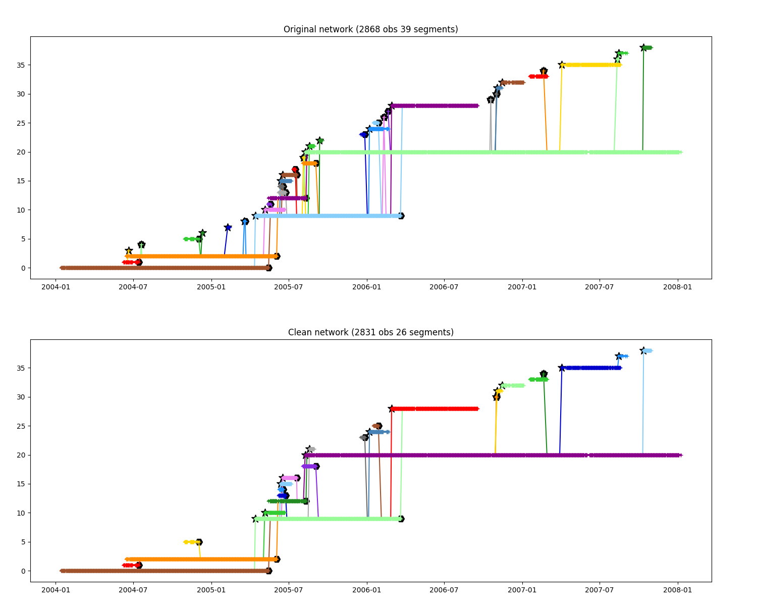
For further figure we will use clean path
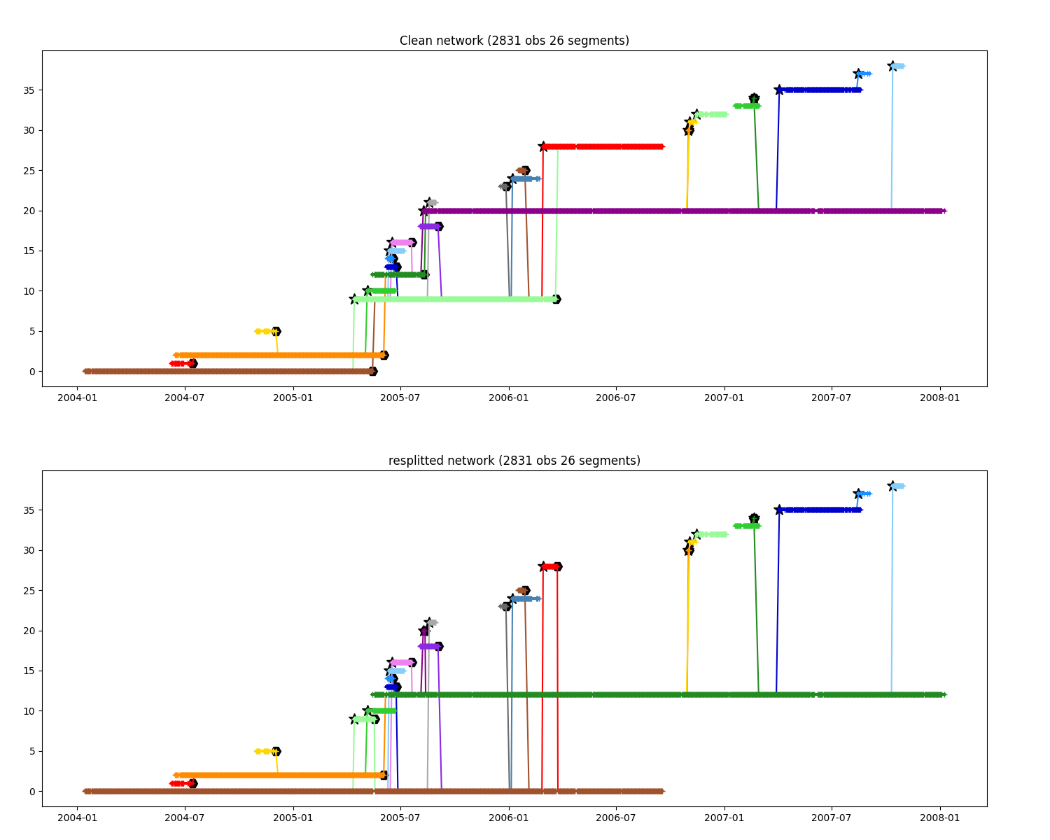
Change splitting-merging events
change event where seg A split to B, then A merge into B, to A split to B then B merge into A
fig = plt.figure(figsize=(15, 12))
ax = fig.add_axes([0.04, 0.54, 0.90, 0.40])
ax.set_title(f"Clean network ({n.infos()})")
n.display_timeline(ax)

clean_modified = n.copy()
# If it's happen in less than 40 days
clean_modified.correct_close_events(40)

ax = fig.add_axes([0.04, 0.04, 0.90, 0.40])
ax.set_title(f"resplitted network ({clean_modified.infos()})")
_ = clean_modified.display_timeline(ax)
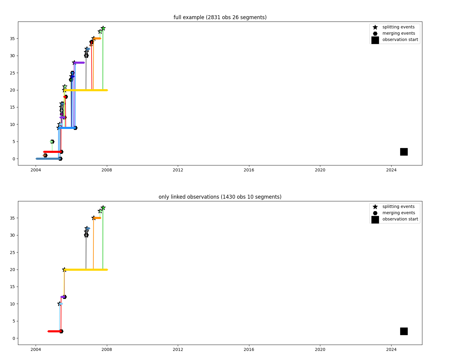
Keep only observations where water could propagate from an observation
i_observation = 600
only_linked = n.find_link(i_observation)

fig = plt.figure(figsize=(15, 12))
ax1 = fig.add_axes([0.04, 0.54, 0.90, 0.40])
ax2 = fig.add_axes([0.04, 0.04, 0.90, 0.40])

kw = dict(marker="s", s=300, color="black", zorder=200, label="observation start")
for ax, dataset in zip([ax1, ax2], [n, only_linked]):
    dataset.display_timeline(ax, field="segment", lw=2, markersize=5, colors_mode="y")
    ax.scatter(n.time[i_observation], n.segment[i_observation], **kw)
    ax.legend()

ax1.set_title(f"full example ({n.infos()})")
ax2.set_title(f"only linked observations ({only_linked.infos()})")
_ = ax2.set_xlim(ax1.get_xlim()), ax2.set_ylim(ax1.get_ylim())
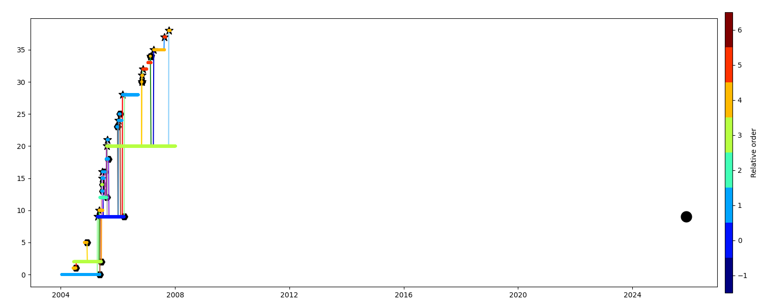
Keep close relative
When you want to investigate one particular observation and select only the closest segments
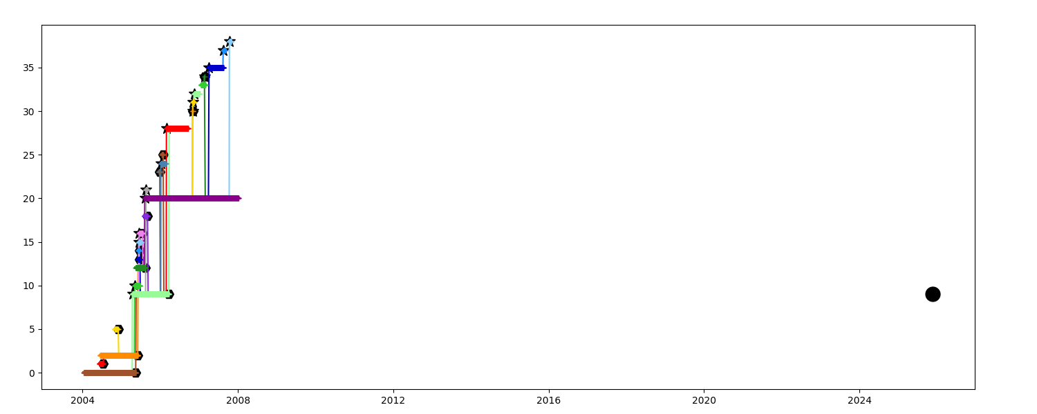
Colors show the relative order of the segment with regards to the chosen one
fig = plt.figure(figsize=(15, 6))
ax = fig.add_axes([0.04, 0.06, 0.90, 0.88])
m = n.scatter_timeline(
    ax, n.obs_relative_order(i), vmin=-1.5, vmax=6.5, cmap=plt.get_cmap("jet", 8), s=10
)
ax.plot(*obs_args, **obs_kw)
cb = plt.colorbar(
    m["scatter"], cax=fig.add_axes([0.95, 0.04, 0.01, 0.92]), orientation="vertical"
)
cb.set_label("Relative order")
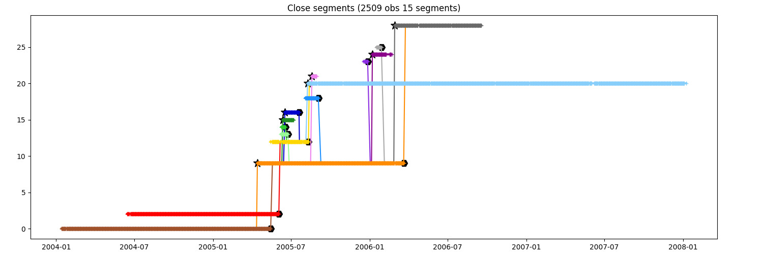
You want to keep only the segments at the order 1
fig = plt.figure(figsize=(15, 5))
ax = fig.add_axes([0.04, 0.06, 0.90, 0.88])
close_to_i1 = n.relative(i, order=1)
ax.set_title(f"Close segments ({close_to_i1.infos()})")
_ = close_to_i1.display_timeline(ax)
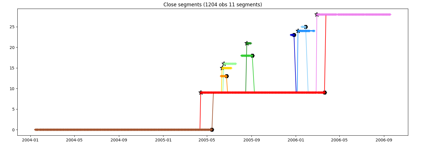
You want to keep the segments until order 2
fig = plt.figure(figsize=(15, 5))
ax = fig.add_axes([0.04, 0.06, 0.90, 0.88])
close_to_i2 = n.relative(i, order=2)
ax.set_title(f"Close segments ({close_to_i2.infos()})")
_ = close_to_i2.display_timeline(ax)
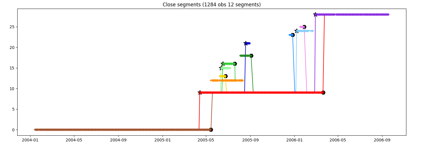
You want to keep the segments until order 3
fig = plt.figure(figsize=(15, 5))
ax = fig.add_axes([0.04, 0.06, 0.90, 0.88])
close_to_i3 = n.relative(i, order=3)
ax.set_title(f"Close segments ({close_to_i3.infos()})")
_ = close_to_i3.display_timeline(ax)
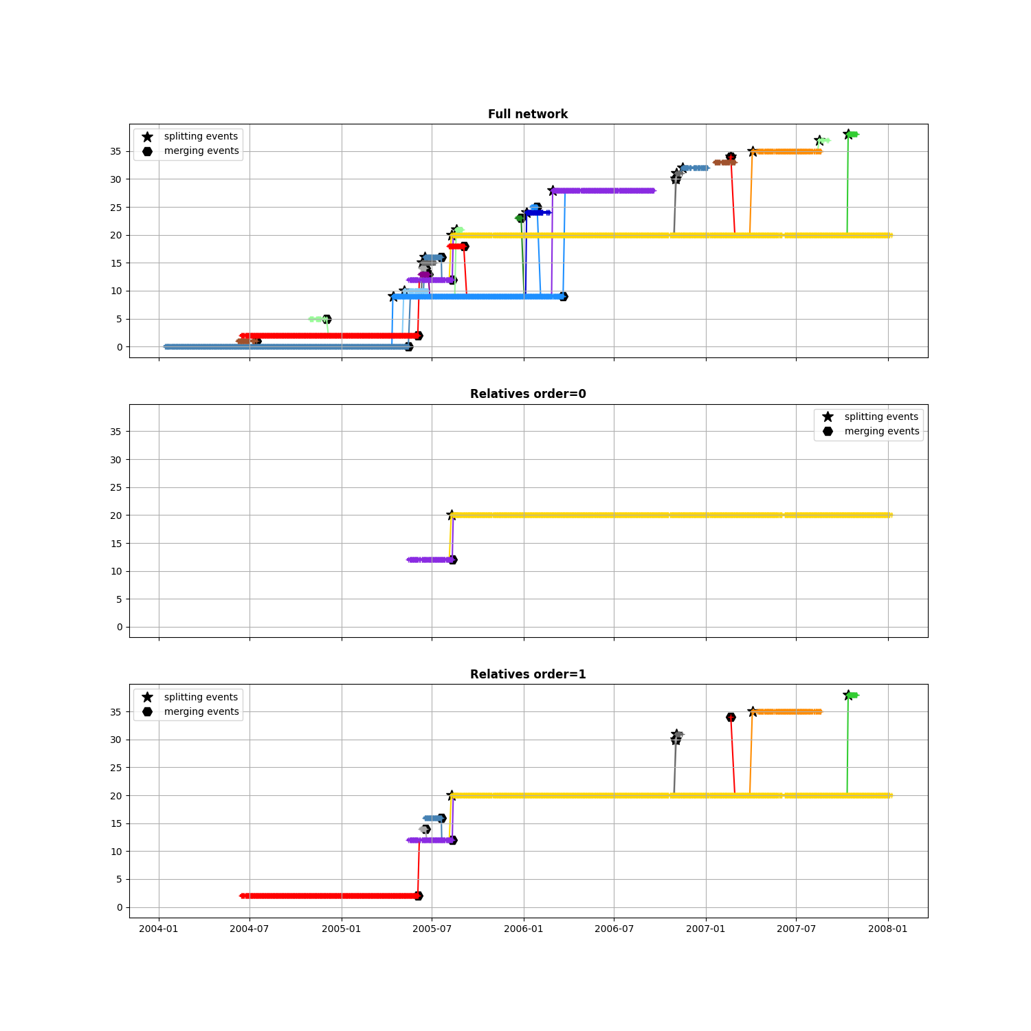
Keep relatives to an event
When you want to investigate one particular event and select only the closest segments
First choose a merging event in the network
after, before, stopped = n.merging_event(triplet=True, only_index=True)
i_event = 7
then see some order of relatives
max_order = 1
fig, axs = plt.subplots(
    max_order + 2, 1, sharex=True, figsize=(15, 5 * (max_order + 2))
)
# Original network
ax = axs[0]
ax.set_title("Full network", weight="bold")
n.display_timeline(axs[0], colors_mode="y")
ax.grid(), ax.legend()

for k in range(0, max_order + 1):
    ax = axs[k + 1]
    ax.set_title(f"Relatives order={k}", weight="bold")
    # Extract neighbours of event
    sub_network = n.find_segments_relative(after[i_event], stopped[i_event], order=k)
    sub_network.display_timeline(ax, colors_mode="y")
    ax.legend(), ax.grid()
    _ = ax.set_ylim(axs[0].get_ylim())
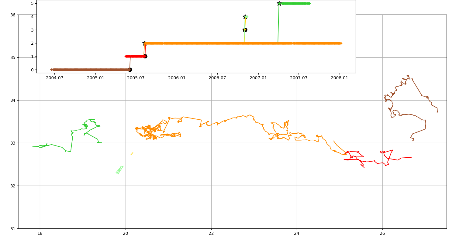
Display track on map
# Get a simplified network
n = n2.copy()
n.remove_dead_end(nobs=50, recursive=1)
n = n.remove_trash()
n.numbering_segment()
Only a map can be tricky to understand, with a timeline it’s easier!
fig = plt.figure(figsize=(15, 8))
ax = fig.add_axes([0.04, 0.06, 0.94, 0.88], projection=GUI_AXES)
n.plot(ax, color_cycle=n.COLORS)
ax.set_xlim(17.5, 27.5), ax.set_ylim(31, 36), ax.grid()
ax = fig.add_axes([0.08, 0.7, 0.7, 0.3])
_ = n.display_timeline(ax)
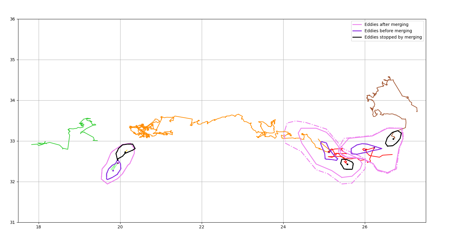
Get merging event
Display the position of the eddies after a merging
fig = plt.figure(figsize=(15, 8))
ax = fig.add_axes([0.04, 0.06, 0.90, 0.88], projection=GUI_AXES)
n.plot(ax, color_cycle=n.COLORS)
m1, m0, m0_stop = n.merging_event(triplet=True)
m1.display(ax, color="violet", lw=2, label="Eddies after merging")
m0.display(ax, color="blueviolet", lw=2, label="Eddies before merging")
m0_stop.display(ax, color="black", lw=2, label="Eddies stopped by merging")
ax.plot(m1.lon, m1.lat, marker=".", color="purple", ls="")
ax.plot(m0.lon, m0.lat, marker=".", color="blueviolet", ls="")
ax.plot(m0_stop.lon, m0_stop.lat, marker=".", color="black", ls="")
ax.legend()
ax.set_xlim(17.5, 27.5), ax.set_ylim(31, 36), ax.grid()
m1
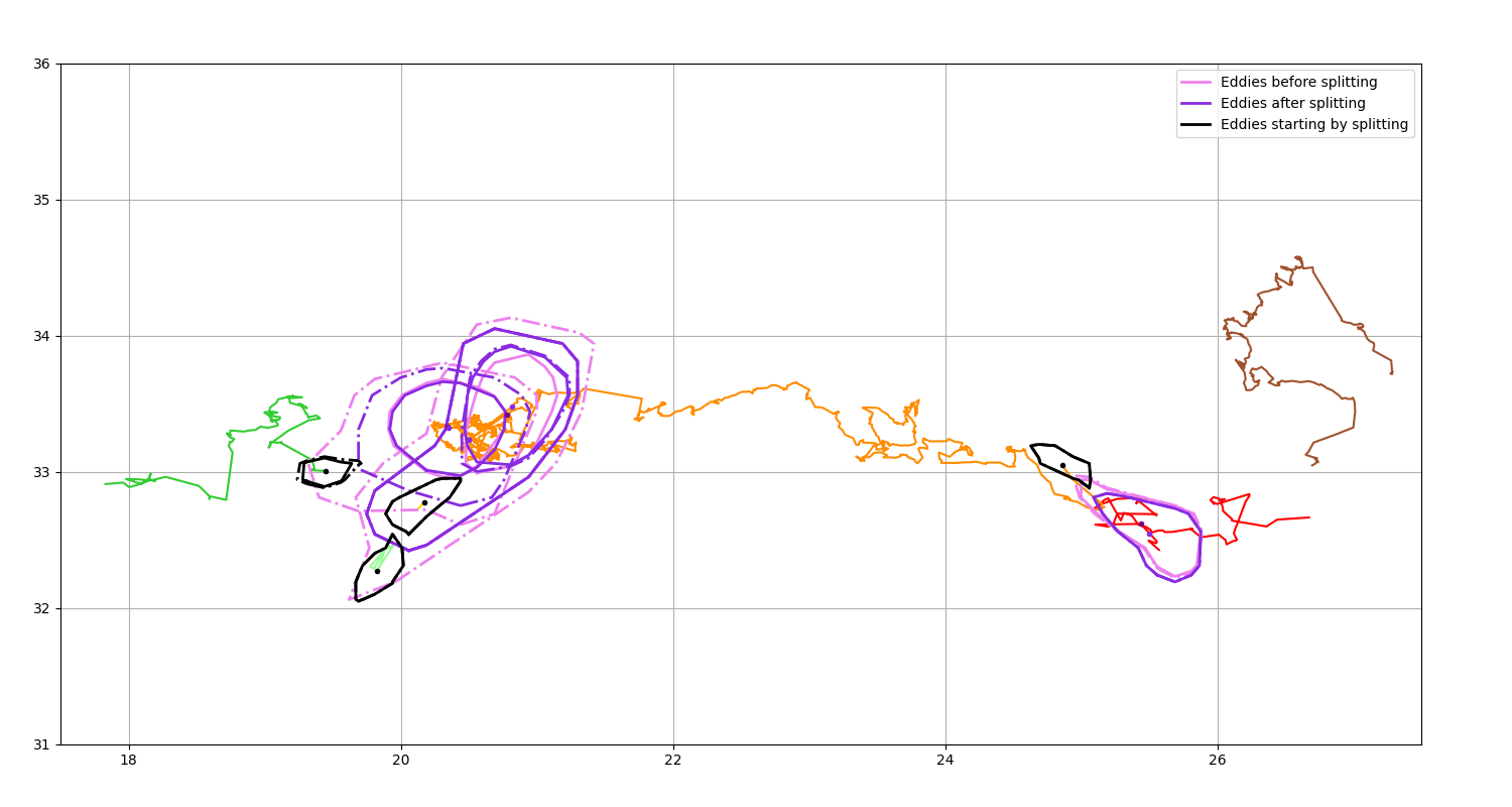
Get splitting event
Display the position of the eddies before a splitting
fig = plt.figure(figsize=(15, 8))
ax = fig.add_axes([0.04, 0.06, 0.90, 0.88], projection=GUI_AXES)
n.plot(ax, color_cycle=n.COLORS)
s0, s1, s1_start = n.splitting_event(triplet=True)
s0.display(ax, color="violet", lw=2, label="Eddies before splitting")
s1.display(ax, color="blueviolet", lw=2, label="Eddies after splitting")
s1_start.display(ax, color="black", lw=2, label="Eddies starting by splitting")
ax.plot(s0.lon, s0.lat, marker=".", color="purple", ls="")
ax.plot(s1.lon, s1.lat, marker=".", color="blueviolet", ls="")
ax.plot(s1_start.lon, s1_start.lat, marker=".", color="black", ls="")
ax.legend()
ax.set_xlim(17.5, 27.5), ax.set_ylim(31, 36), ax.grid()
s1
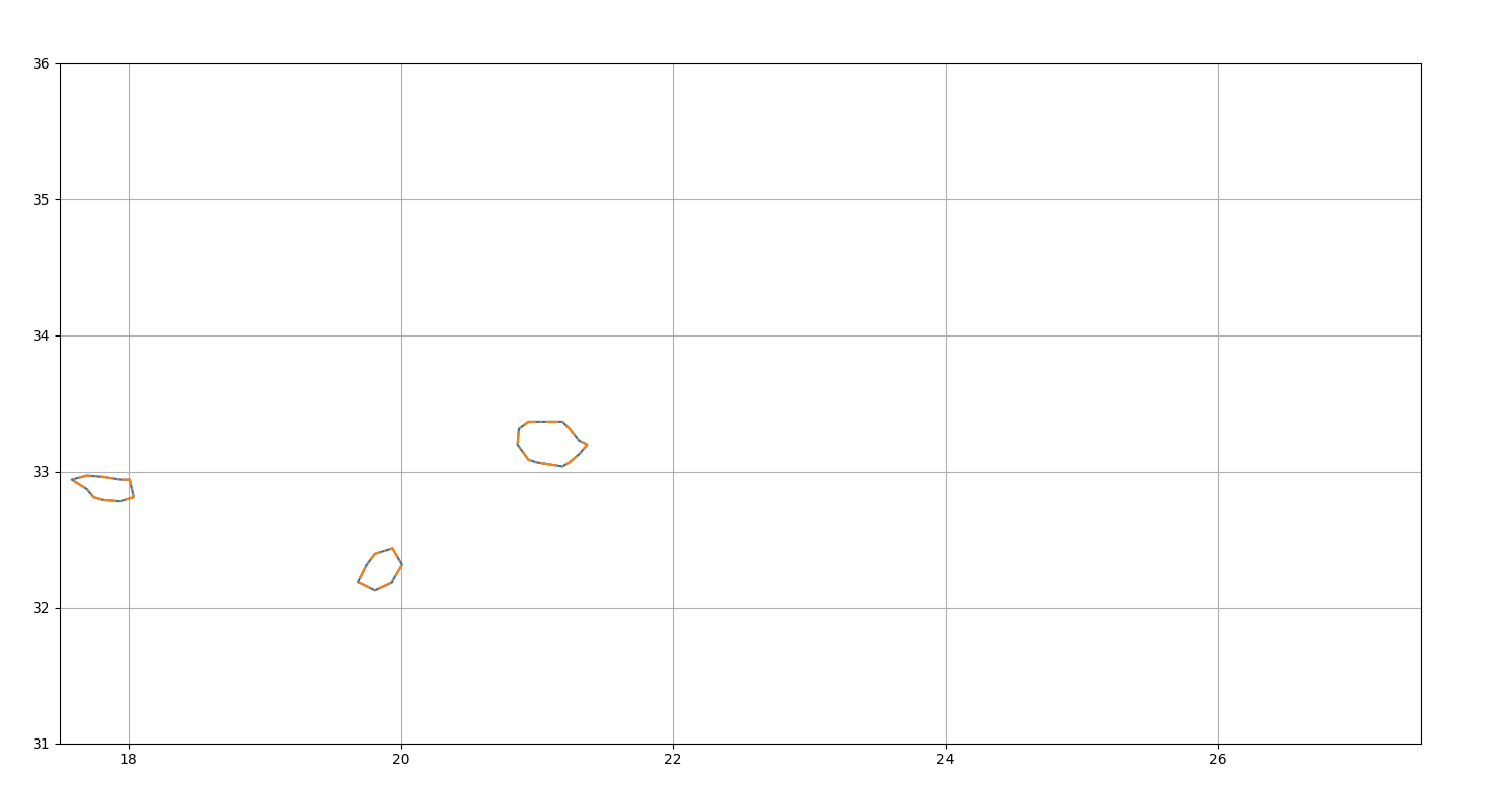
Get birth event
Display the starting position of non-splitted eddies
fig = plt.figure(figsize=(15, 8))
ax = fig.add_axes([0.04, 0.06, 0.90, 0.88], projection=GUI_AXES)
birth = n.birth_event()
birth.display(ax)
ax.set_xlim(17.5, 27.5), ax.set_ylim(31, 36), ax.grid()
birth
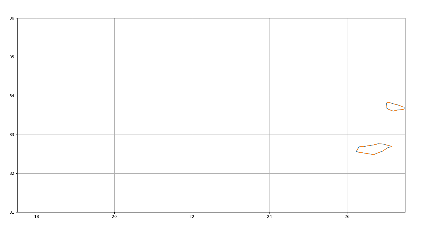
Get death event
Display the last position of non-merged eddies
fig = plt.figure(figsize=(15, 8))
ax = fig.add_axes([0.04, 0.06, 0.90, 0.88], projection=GUI_AXES)
death = n.death_event()
death.display(ax)
ax.set_xlim(17.5, 27.5), ax.set_ylim(31, 36), ax.grid()
death
Total running time of the script: (0 minutes 2.928 seconds)