Note
Go to the end to download the full example code. or to run this example in your browser via Binder
Geographical statistics
from matplotlib import pyplot as plt
import py_eddy_tracker_sample

from py_eddy_tracker.observations.tracking import TrackEddiesObservations


def start_axes(title):
    fig = plt.figure(figsize=(13.5, 5))
    ax = fig.add_axes([0.03, 0.03, 0.90, 0.94])
    ax.set_xlim(-6, 36.5), ax.set_ylim(30, 46)
    ax.set_aspect("equal")
    ax.set_title(title)
    return ax
Load an experimental med atlas over a period of 26 years (1993-2019), we merge the 2 datasets
a = TrackEddiesObservations.load_file(
    py_eddy_tracker_sample.get_demo_path(
        "eddies_med_adt_allsat_dt2018/Anticyclonic.zarr"
    )
)
c = TrackEddiesObservations.load_file(
    py_eddy_tracker_sample.get_demo_path("eddies_med_adt_allsat_dt2018/Cyclonic.zarr")
)
a = a.merge(c)

step = 0.1
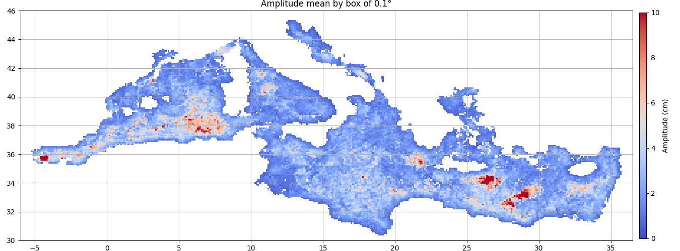
Mean of amplitude in each box
ax = start_axes("Amplitude mean by box of %s°" % step)
g = a.grid_stat(((-7, 37, step), (30, 46, step)), "amplitude")
m = g.display(ax, name="amplitude", vmin=0, vmax=10, factor=100)
ax.grid()
cb = plt.colorbar(m, cax=ax.figure.add_axes([0.94, 0.05, 0.01, 0.9]))
cb.set_label("Amplitude (cm)")
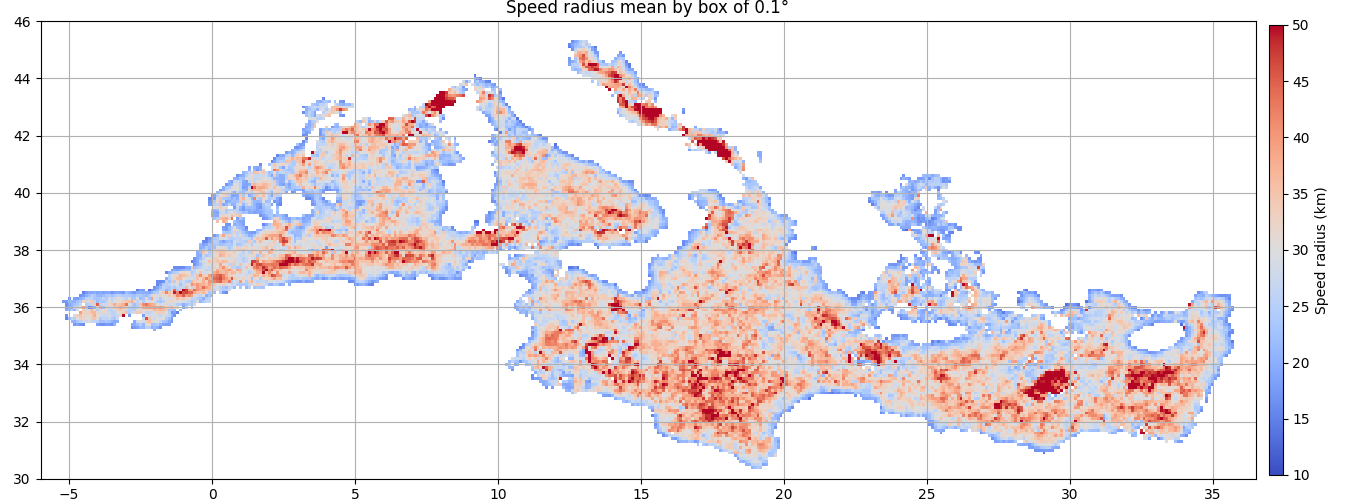
Mean of speed radius in each box
ax = start_axes("Speed radius mean by box of %s°" % step)
g = a.grid_stat(((-7, 37, step), (30, 46, step)), "radius_s")
m = g.display(ax, name="radius_s", vmin=10, vmax=50, factor=0.001)
ax.grid()
cb = plt.colorbar(m, cax=ax.figure.add_axes([0.94, 0.05, 0.01, 0.9]))
cb.set_label("Speed radius (km)")
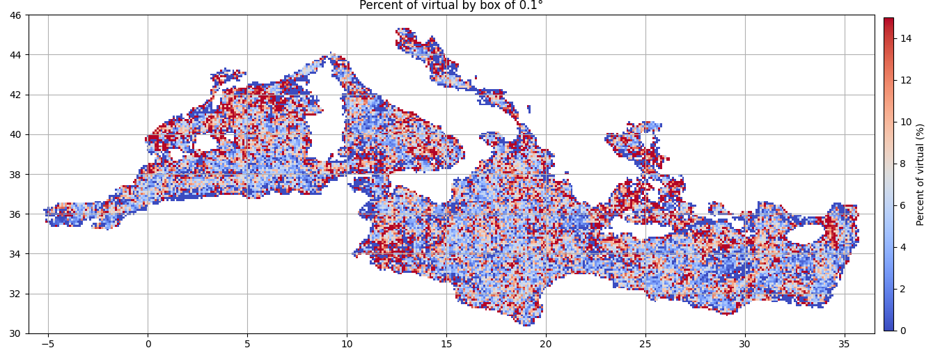
Percent of virtual on the whole obs in each box
ax = start_axes("Percent of virtual by box of %s°" % step)
g = a.grid_stat(((-7, 37, step), (30, 46, step)), "virtual")
g.vars["virtual"] *= 100
m = g.display(ax, name="virtual", vmin=0, vmax=15)
ax.grid()
cb = plt.colorbar(m, cax=ax.figure.add_axes([0.94, 0.05, 0.01, 0.9]))
cb.set_label("Percent of virtual (%)")
Total running time of the script: (0 minutes 2.448 seconds)